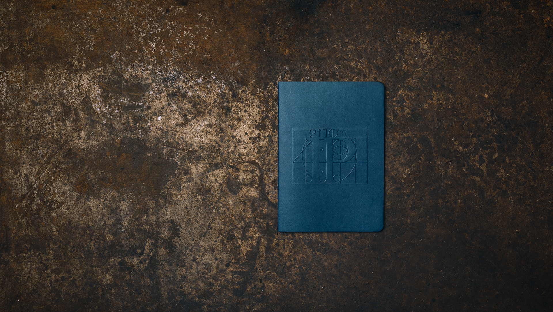
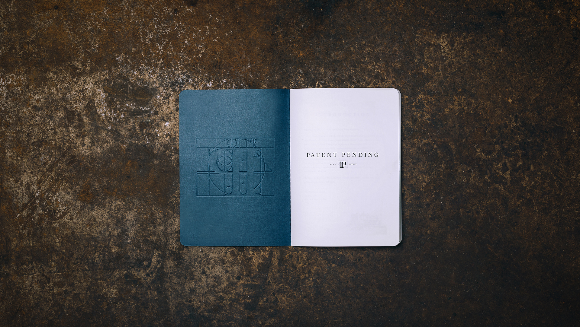
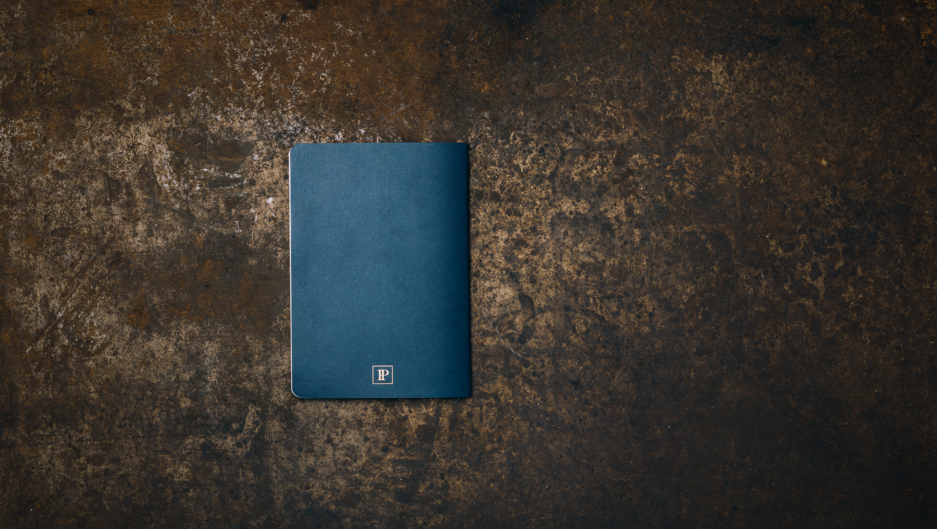
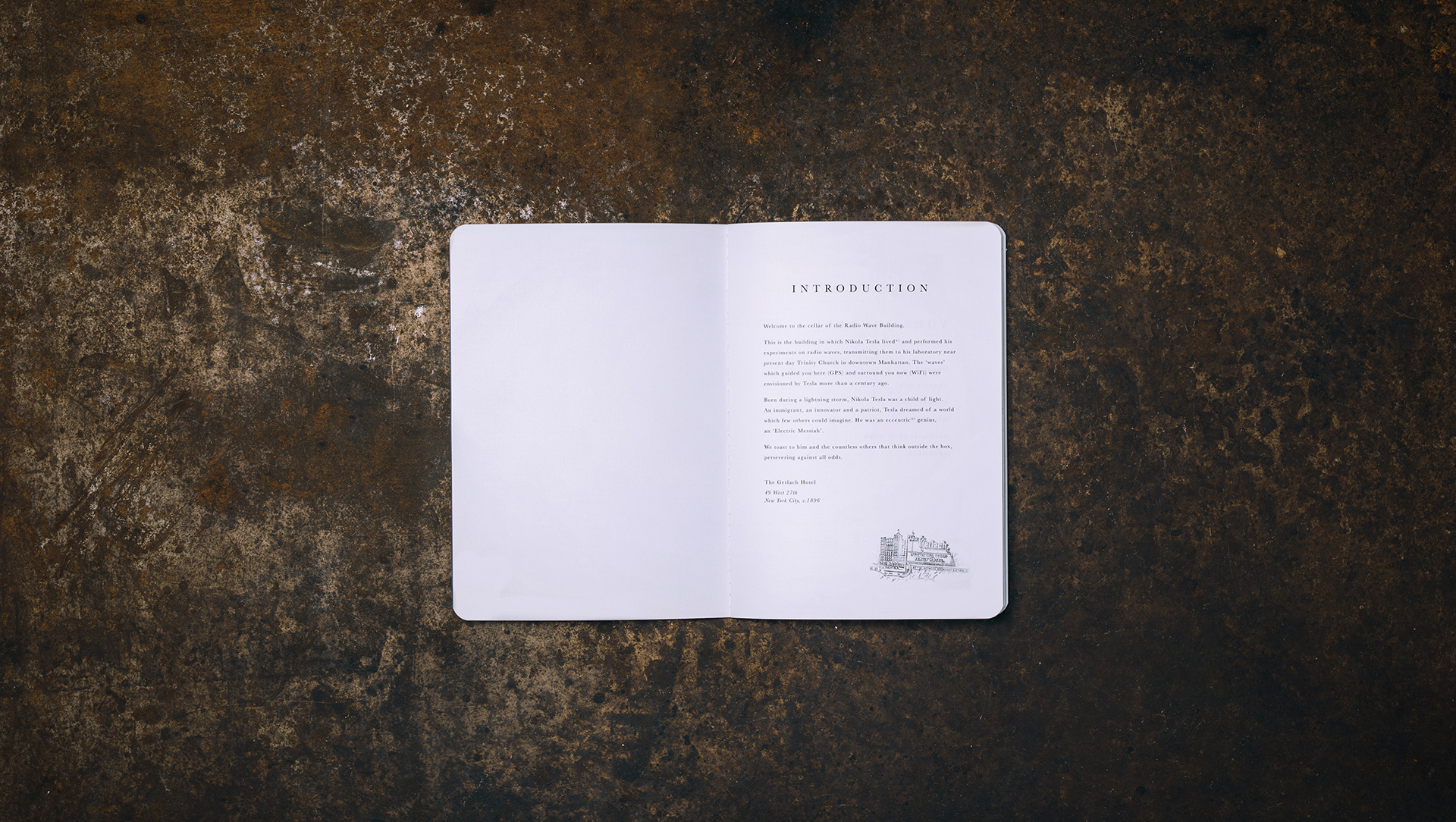
BLUE PARK

BLUE PARK

This was a proposed logo option for a warm and hearty QSR. A restaurant that serves rice bowls composed of wholesome ingredients. The overall logo form was inspired by wooden park signs, a symbol that can be defined as welcoming and communal. A brand designed to visually represent indigenous grounds and all of its rich natural elements. 


Art Director
Designer


hero.jpg
2.jpg
3.jpg
4.jpg
8.jpg
7.jpg
5.jpg

BRUSCHETTA BAR

BRUSCHETTA BAR

This was a proposed logo option for a bruschetta bar concept. A restaurant/bar with a limited menu specifically made to wine and dine on the finest blends and chef driven bruschetta's. This brand was inspired by the organic composition of a bruschetta, we developed an identity that mixes all of its elements with a pinch of simplicity and sophistication. The handcrafted and classical style compliments the art of making great bruschetta. 


Art Director
Designer


hero.jpg
2.jpg
3.jpg
3.2.jpg
6.jpg
7.jpg
5.jpg
9.jpg
11.jpg
10.jpg
12.jpg
13.jpg
14.jpg
15.jpg

CHAMA MAMA

CHAMA MAMA

This was a proposed logo option for Chama Mama, an authentic Georgian fast casual restaurant. Inspired by the mountainous landscapes in Georgia, mimicking its rocky and earthy terrain. The texturized stamp logo encompasses femininity, flavor, and Georgian roots. The handmade aesthetic will transport all customers to Chama Mama's Georgian countryside kitchen.


Art Director
Designer


hero.jpg
2.jpg
11.jpg
3.2.jpg
4.jpg
8.jpg
7.jpg
6.jpg
8.jpg
10.jpg
5.jpg

PICK POCK

PICK POCK

Here's a brand identity for a QSR ravioli concept. Pick Pock embodies flavor/innovation and accepts all the fun that comes with eating stuffed pasta. We analyzed the shape and functionality of a ravioli to create a playful brand. Using a quirky and wiggly line we illustrated a crafty logo mark to bring the obscure meaning of Pick Pock to life.


Art Director
Designer


hero.jpg
2.jpg
3.jpg
 
4.jpg
5.jpg
6.JPG
Pick_Pock-icons.gif
9.JPG
casestudygif.gif
11.JPG
12.JPG